Brand Identity for RusAgroTrading, a Leader in the Grain Market
Team


Services
- Conception
Client
- RusAgroTrading

The Challenge
RusAgroTrading lacked a cohesive brand identity: there was no logo, no unified visual system, and communication was fragmented. At the same time, the company is one of the largest players in the Russian grain market. The goal was to build a complete brand — modern, recognizable, and easily scalable across all touchpoints, from the website and documentation to railcars, merchandise, and staff uniforms.

Logo
We started with the foundation — the logo. It combines two core business associations:
— A wheat ear, symbolizing agriculture
— Coupled railcars, referencing transportation logistics and operational scale
The final mark is highly versatile — it can be read both as the structure of a wheat ear and as a sequence of railcars. Over time, an additional meaning emerged: the shape also resembles grain storage containers. This idea evolved into a brand pattern, symbolizing an endless field and an uninterrupted supply chain.

Naming
Another key task was shortening the brand name. This led to the abbreviation RAT, which is easy to remember, works well in English, and subtly references grain through familiar agricultural associations. The full name was retained for formal and official use.


Color Palette
A deep blue became the foundation of the brand, chosen for:
— Brand continuit
— A visual link to traditional blue railcars
— Ease of scaling across digital and physical medi

Visual System
The identity was applied across all types of railcars, complemented by branded merchandise, employee uniforms, and branded grain elevators.
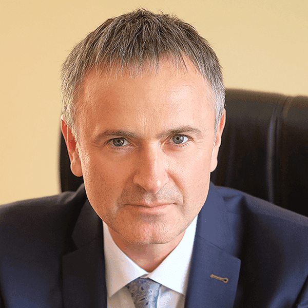
Oleg Anatolyevich
CEO of RusAgroTrading
RusAgroTrading LLC expresses sincere gratitude and appreciation for the collaboration. We were looking for a team capable of creating our corporate identity, and you didn’t just succeed — you exceeded all expectations! The logo, the website, the merchandise — everything is great, but most importantly, the branding of the railcars! They are no longer just transportation, but a bright symbol of our brand. Thank you for your creativity, attention to every detail, and for capturing our idea so precisely. Working with you was easy, pleasant, and inspiring.


